Today I did Art in the Schools with a second grade class. I have had lots of requests for Classroom Canvases…which I love doing, but it’s fun to do other things too. This color wheel session is one of my favorites because it teaches basic color theory–which totally makes me geek out.
Inspiration for this session originally came from this post on a blog that I really love. She has lots of great art inspiration for classes of all ages.
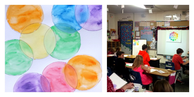
I started by explaining the color wheel. I was so impressed by this class. They were so well behaved and such good listeners. I made a diagram to illustrate the lesson. It’s just on poster board, and colored with crayons. We discussed the diagram, working from the inside out. At the center are the three primary colors. Next, along their edges, are the secondary colors–what you get if you mix those two primary colors together. The outer edge includes, primary, secondary and tertiary colors {those between primary and secondary colors.}
Most importantly, I explained the concept of analogous colors–those that are similar and sit next to one another on the color wheel. The black lines on the diagram link up the analogous colors of a secondary color wheel.
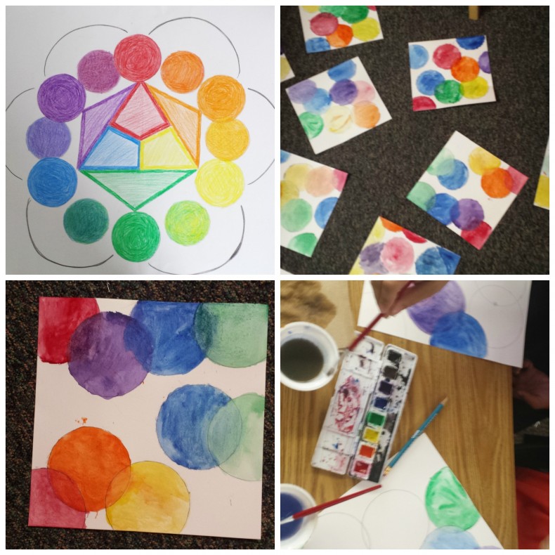
For our project I had kids trace circles {which they claimed was cheating–gasp!} on a sheet of water color paper, overlapping at the edges. Then, using water color paint, they filled their circles in using analogous colors. Here’s the gist. You can start with any color you like. Paint the entire circle. Then move on to a circle it overlaps. This circle must be painted with an analogous color–blending the paint where the two overlap, to reveal a tertiary color. Keep going until they are all filled in. It takes a little planning so that you don’t get stuck with a circle that cannot be matched–but this class had no problems with it. The diagram really helped those who got stuck. I just referred them back to the wheel when they were unsure of what color to use next–just follow the black line to see the two choices.
I emphasized that analogous colors are those that blend well together. They are colors we naturally want to mix. That colors from one primary to the next will blend together well…but if you go further the colors become complimentary and begin to cancel each other out if they are blended. I don’t think that concept stuck with everyone at first, but once they started painting I pointed out that their water reflected what happens when competing colors are mixed–you end up with brown or gray. I overheard one girl tell her desk mate that it looked like sewer water. {I’ve never seen sewer water, but I think it’s a pretty good visual.}
After doing this project I realized that it could also be done just using primary colors–creating a secondary color in the overlap. Maybe I’ll try that next time. At any rate, this was one of the best classes I’ve taught, and I really feel like they learned something. What a fine way to wrap up the week.
Amy